

This project focuses on creating a visually striking and unique design for my CLIENT's professional wrestling gear, ensuring it reflects their persona and enhances their in-ring presence.
Design Objectives:
• Develop a bold and dynamic aesthetic that aligns with my client’s wrestling character.
• Incorporate eye-catching color schemes, intricate patterns, and striking graphic elements.
• Design with symmetry, contrast, and movement in mind to maximize visual impact during action.
• Integrate custom logos or symbolic imagery that reinforce their brand.
• Ensure the overall look is theatrical, memorable, and iconic in the wrestling world.


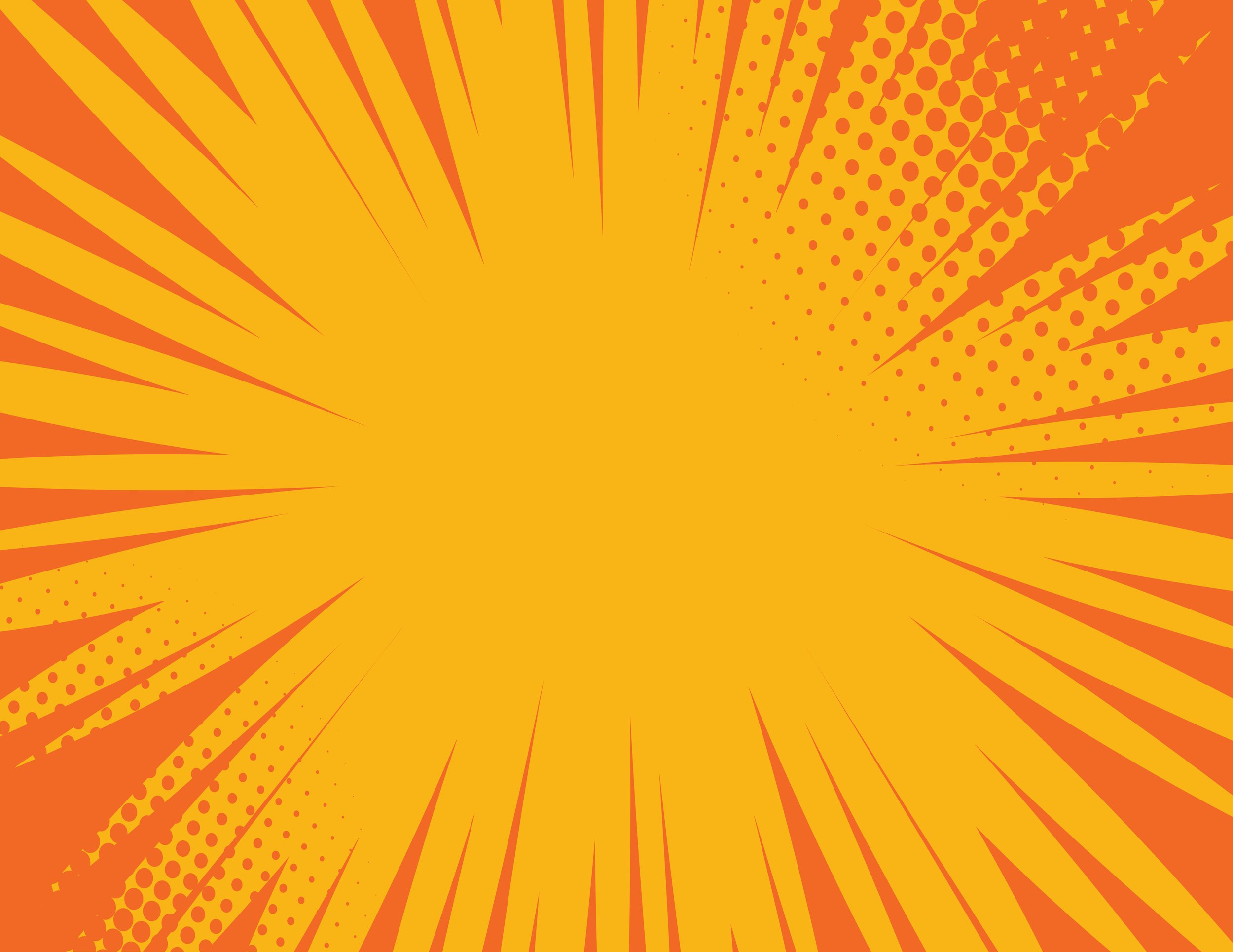
Mood board

Design Process
The research comprised wrestling aesthetics, pop culture, and artistic influences for inspiration. I Created multiple concept sketches exploring different shapes and design details. Refine and finalize the most compelling visual concept that embodies their persona. this project will result in a one-of-a-kind wrestling gear design that captivates audiences and strengthens my client’s identity in the ring.

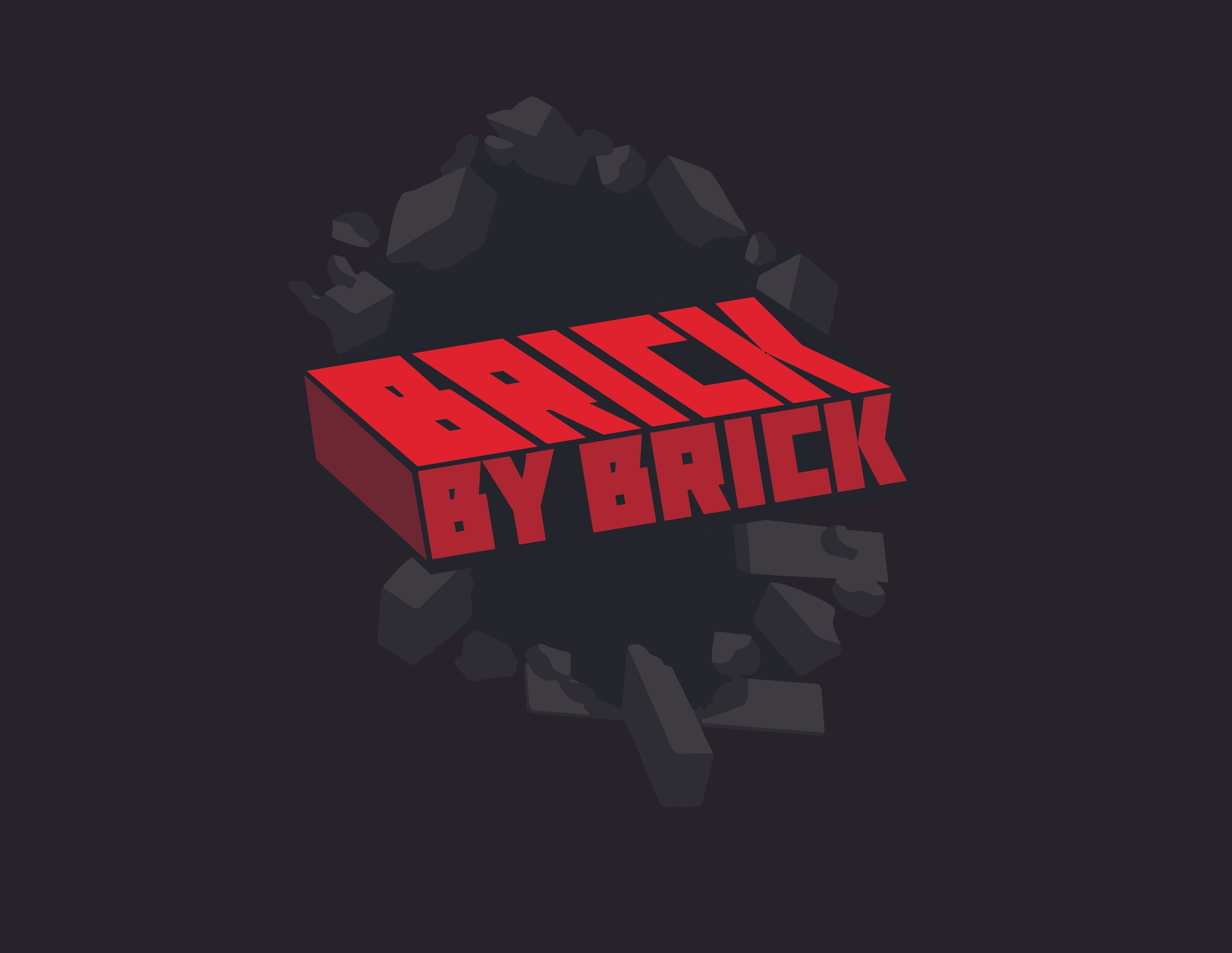
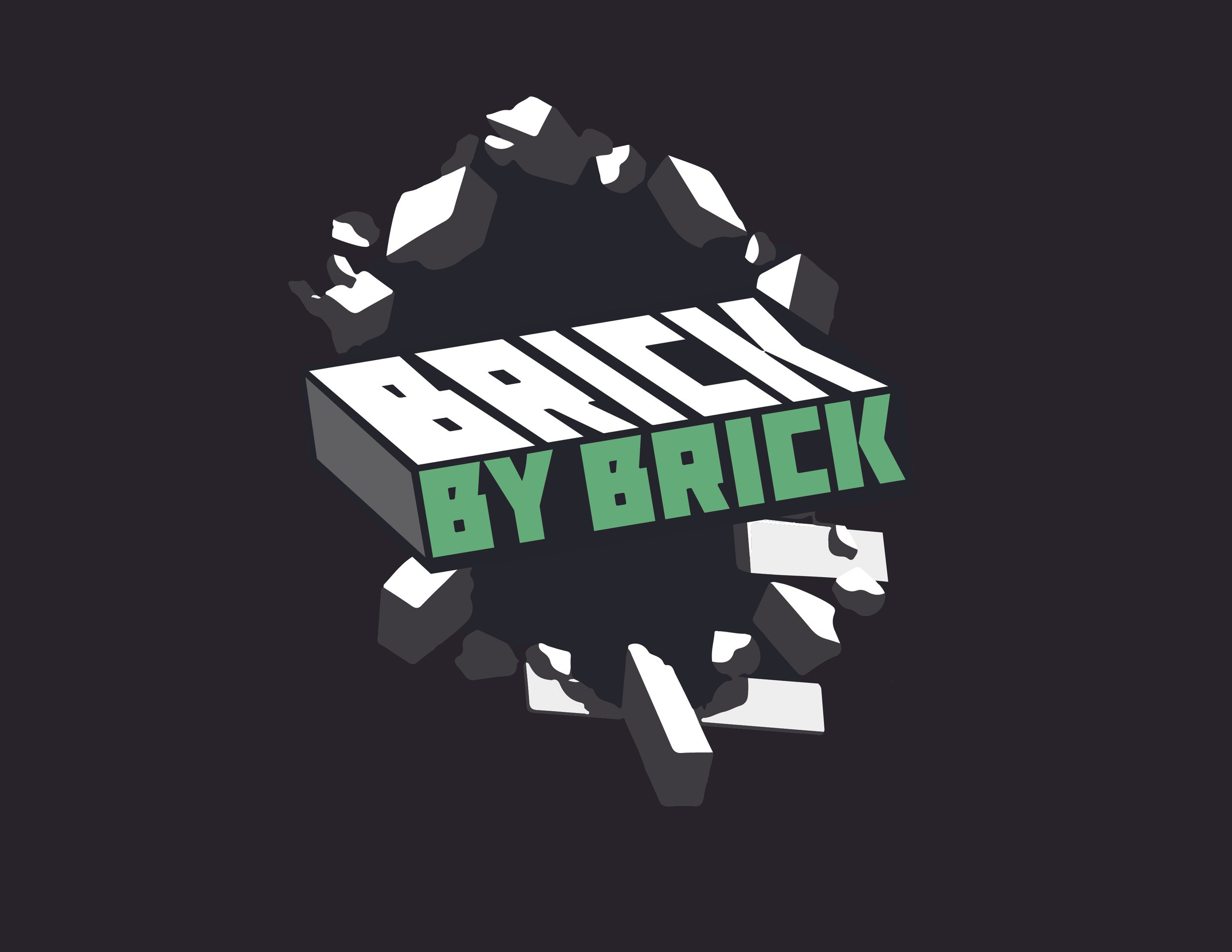
Final Logo (WIP)
Logo sketches


Template Concepts


First draft:
The gear design incorporates a lot of the clients, favorite aspects of other wrestling gear. The pattern on the sides of his pant legs are bricks representing his current persona “Brick by Brick” Robbie Reeves. My client wanted the inclusion of this tagline as well, on the left side of the pant leg I included this tagline exploding through the brick pattern. This represents his explosiveness in the ring. The idea with this design was to make colors easily swappable to keep things fresh. The client requested a specific color scheme for this gear. This color scheme wouldn’t be a part of his newly developed brand standard. But instead, incorporate colors that represent one of his favorite albums. The idea of using colors that follow a brand standard isn’t uncommon in professional wrestling. I would also make the gear in his brand standard colorway.
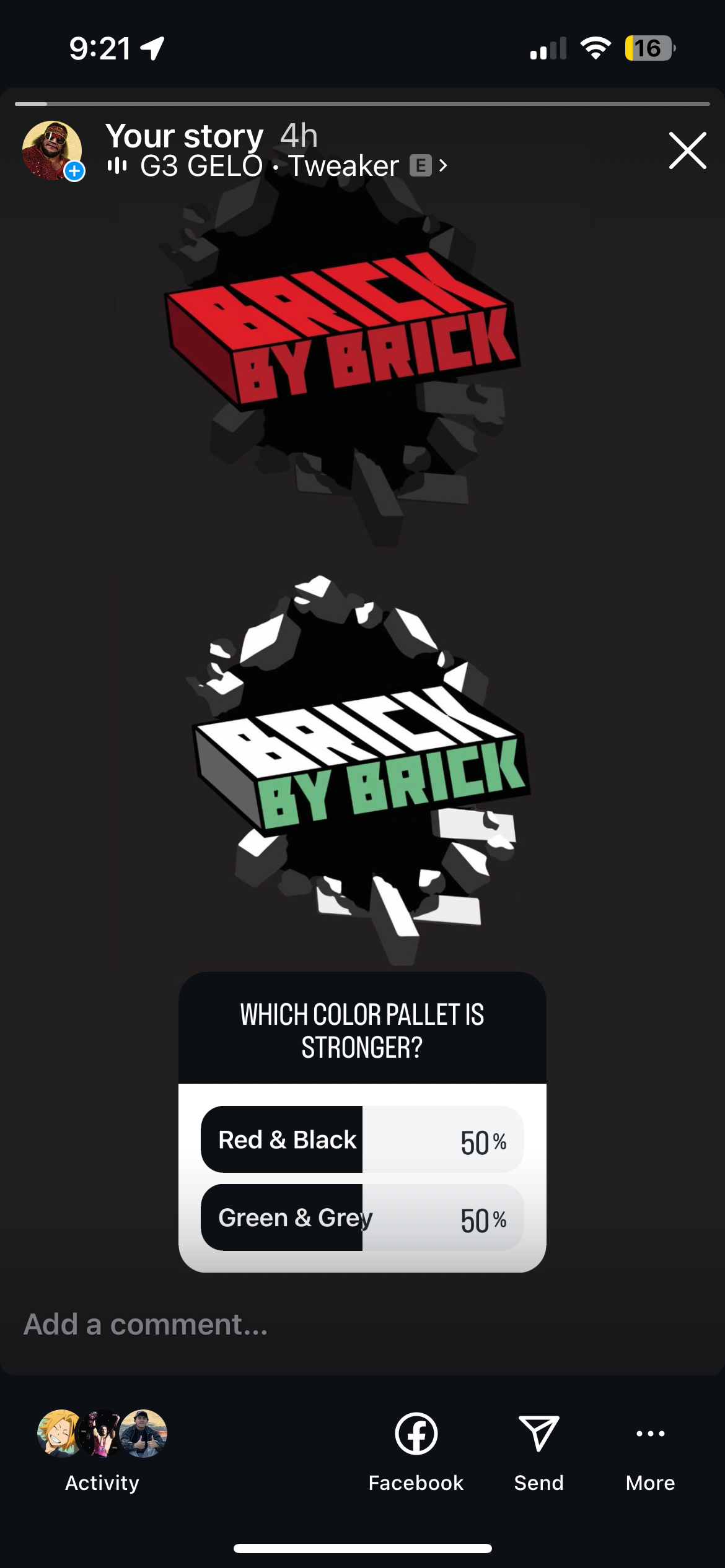
The Poll:
However, this led to some disagreement between the client and myself. This project was to deliver and elevate his current brand. Getting away from the color scheme may lose the message we are trying to capture. Thus losing his brand in this colorway. After some discussion and rethinking, we decided to take a pole with the wrestling community on which color scheme worked. The pole would end up being 50-50.
Final Selection:
After the poll and some more discussion, we ended up deciding that it would be for the best to create the Red and Black gear. This gear will best represent him and his brand especially because he is just starting out in the crazy world of professional wrestling. This gear is more than just something that is eye-catching, it represents the whole brand and identity of my client. Soon the name Robbie Revees will become synonymous to Wrestling fans and it all starts with elevating his current gear and growing his brand.


